|
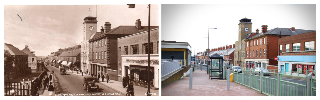
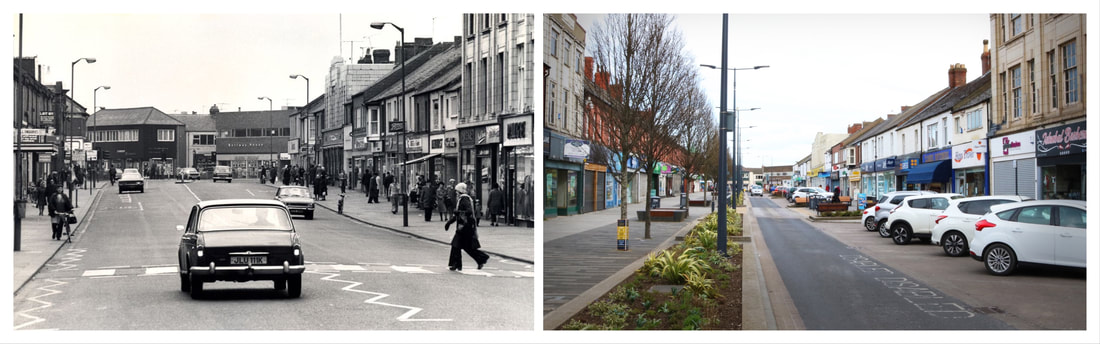
G'day to All. Today I posted on my website a project I've been working on in college. Window to the past. We've been doing our final project in college and I decided to focus on how time changes towns and cities. The first time around I decided to do a side by side comparison of my home town, Ashington, today and up to 100 years ago.
How did I photograph these images?So first of all I needed some images. I delved into the sea of google images and searched around to find the best (and most usable) Old photographs and built up a contact sheet. I grabbed my camera and headed to the city. Finding the right positions was difficult as some were higher up than others, but long story short I managed to get some pretty good shots (and extra ones). Although the sun was in the way so some of the photographs came out pretty exposed - art killer if you ask me! But with a bit of setting adjusting, and a pit stop for a Tesco meal deal, I returned back to college with some good material and a duck wrap. How did I edit them?So! First things first, I found the photos that best lined up with the images and positioned them was best. I decided to use the masking tool as i knew that if i used the eraser tool once its gone, it's gone. I cropped them into rectangles and once again, adjusted the position so they fit perfectly into the image. With that done i decided to add some adjustment layers to the image just to make the modern images pop and contrast from the older images then BOOM, just like that I had my finished product.
0 Comments
My Photographing Process.I used a white coloured foam on top of a blue background as my background, I chose these colours because the cool contrasted and worked well with the warm colours of the necklace. I styled the necklace on top of it, making sure you could see both of the hearts. I took a few different photos trying to make the curve of the white was central. My Editing Process.I actually edited the flowers on. I found a secondary image on google and figured they worked well with the colours of the necklance and the background. I removed the background then used a masking layer to add and copy multiple ones on the blue background. I added a few adjustment layers to increase the contrast and the make the colours stand out better. I also used the paint brush and blur tool to make the colours of the hearts seem more clear since the original picture made them look dirty and dusty. To see my full collection simply click on the image and it'll take you straight to my product page.
Thank you for reading my first blog. Keep an eye out for my next post! |
AuthorHi, I'm Jess, a beginner photographer looking to start my business. if you're interested to know about my work, how i create it, what I've been up to, then this blog is the place for you! ArchivesCategories |


 RSS Feed
